

The Client
Taylight gave us a ring looking for some help re-branding their newly-opened brewery. With this being our 4th brewery branding project to date, we already had ideas flowing.
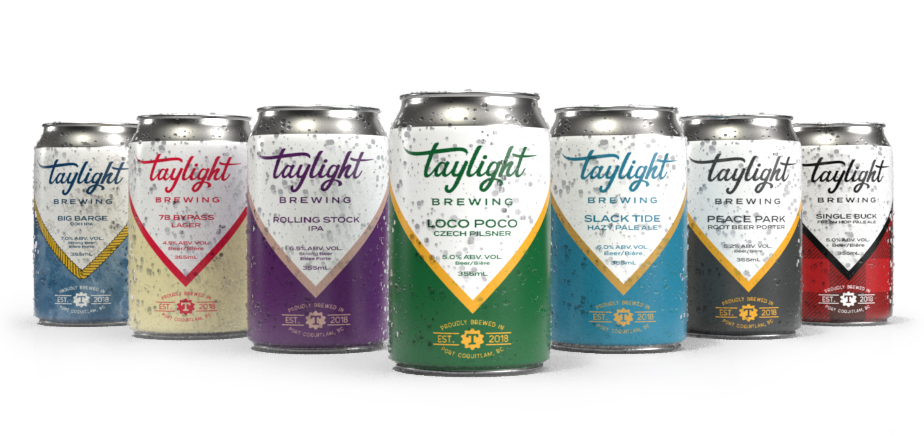
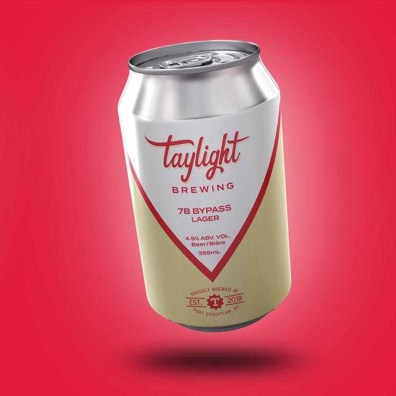
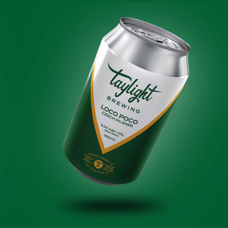
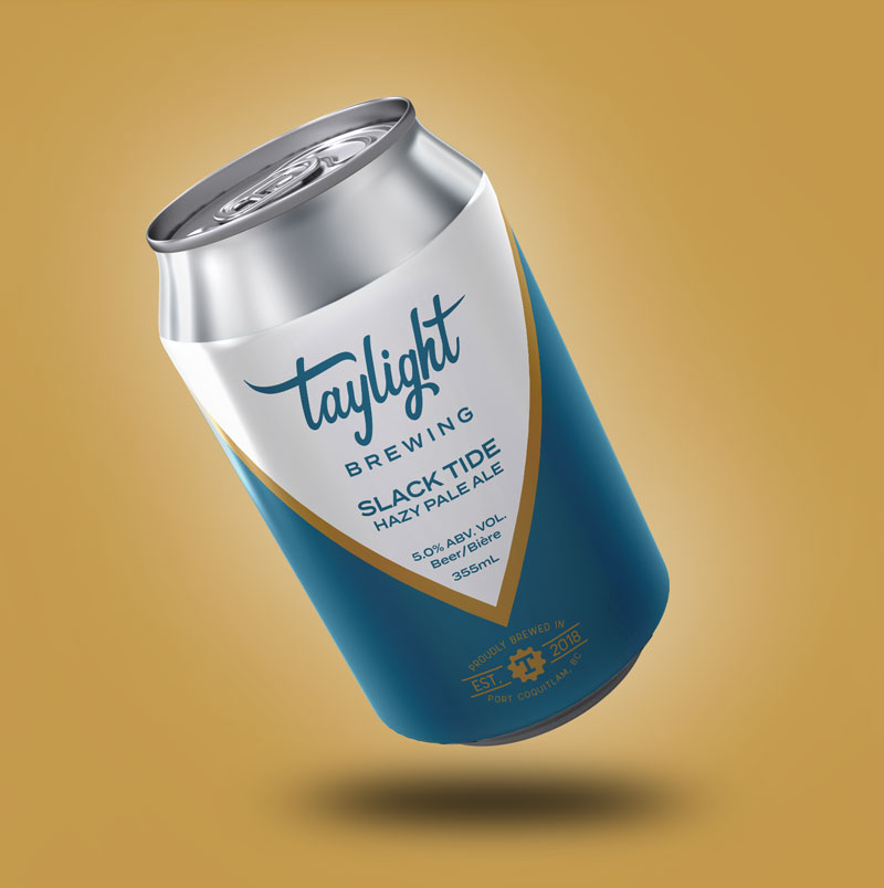
We were tasked with creating a new, modern brand with an old school vibe to really stand the test of time. Under their previous look, only 3 cans were released. When we came into the picture, they immediately fell in love with our first brand concept and suddenly we found ourselves creating the look for five flagship cans and two specialty beers right out of the gate!
This project’s initial stages had us under tight deadlines for the design of the first round of labels. Taylight had a canning session planned in just under two weeks and needed labels to go on those cans. We delivered; our client was over the moon proud to present their new look to the world.
How did we get there, you might ask?
The Process
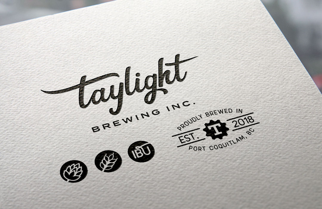
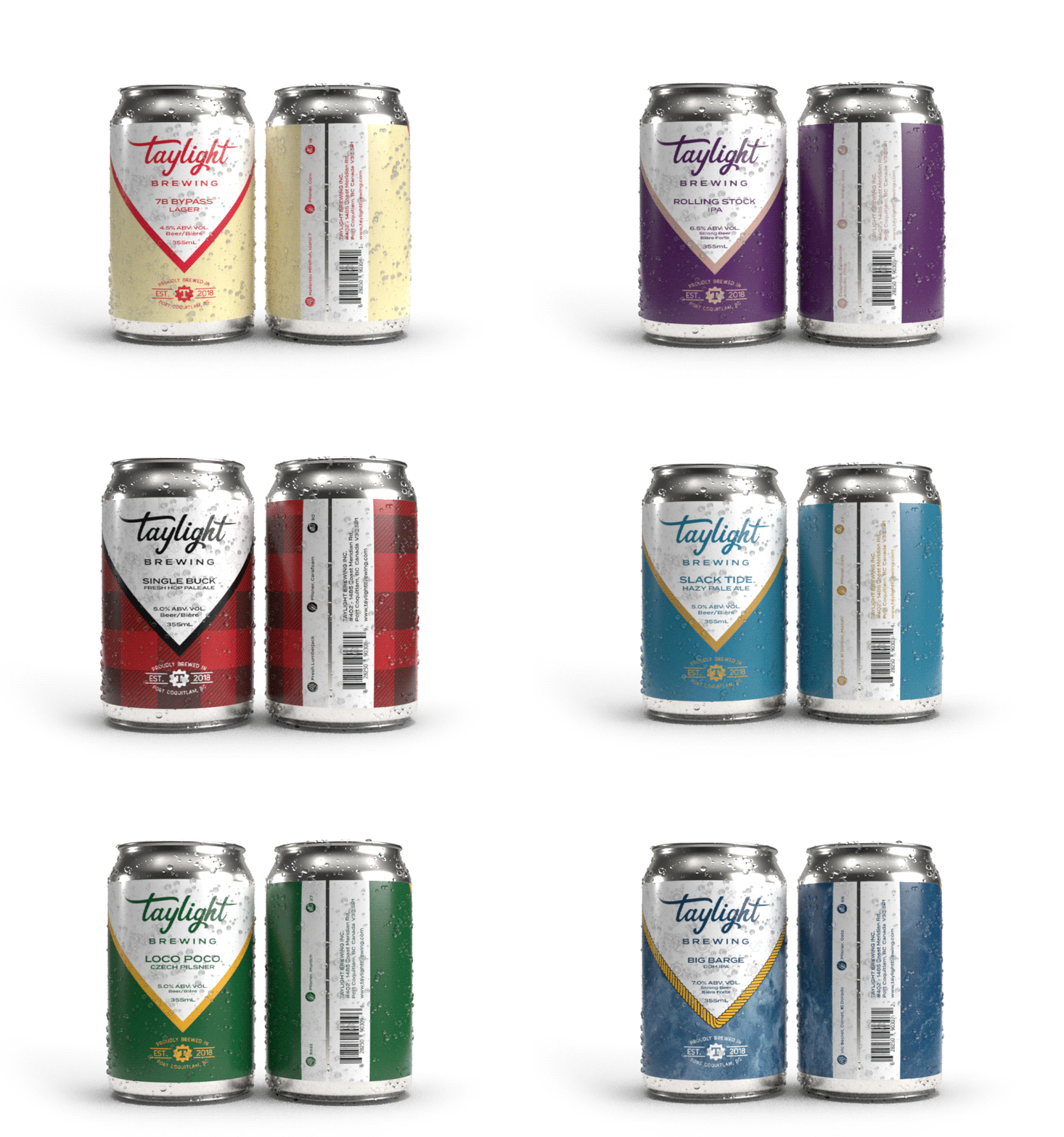
With the overall brand, our goal was to create something modern with a timeless, vintage flare to really stay relevant for years to come. We balanced out a customized hand-lettered script with a bold blocky typeface to anchor everything down nicely and add some contrast. We then incorporated the interior paint colour of the brewery – a yellow-gold colour called “Goldmine” – which wound up working well with the vintage look they were going for.
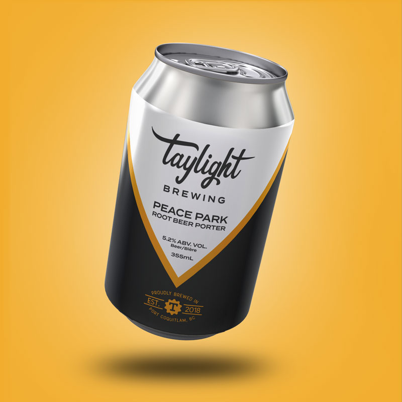
For our flagship colours, we needed them to have a very strong shelf presence. There are so many amazing craft beer brands, that fading into the background was not an option. Our colour choices are always on the audacious side, so we started with the most simple and progressed from there. Dark grey and yellow-gold for a porter is slick as hell, so that was our starting point.
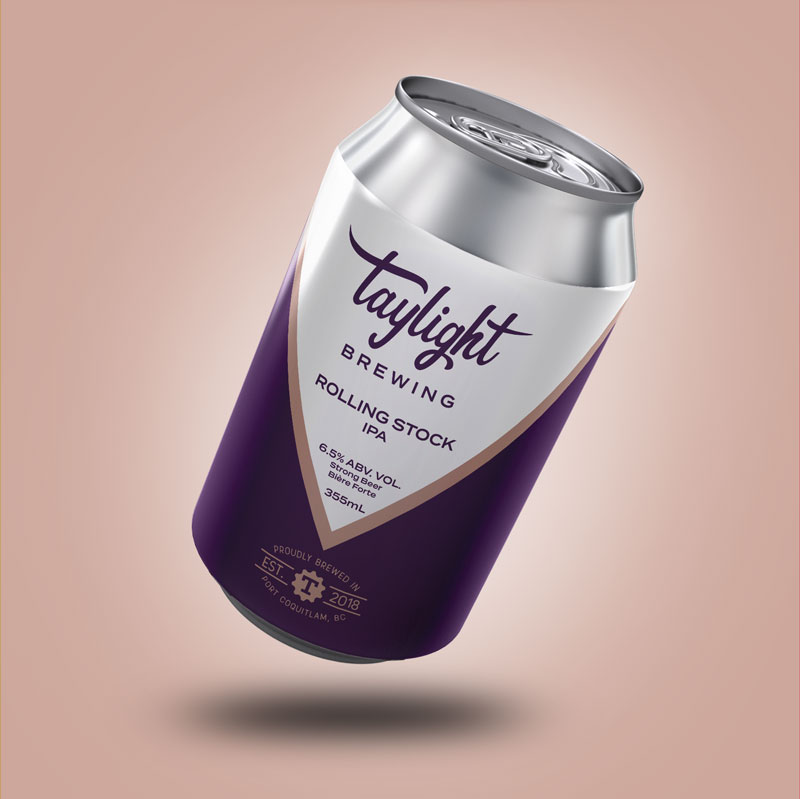
The main five cans were born with different variations with a striking colour variant V separating the white from the chiseled jaw of colour below. From these flagship cans, the more playful specialty beer labels came to be. We turned to bitmap backgrounds and iconography elements to give more pop to the hop(s) for these limited release cans.
Online Presence
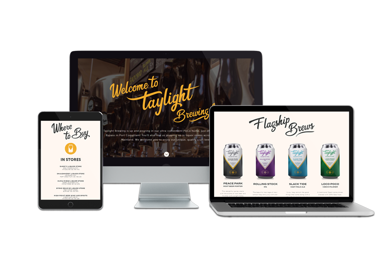
The website was a graphical continuation of everything we had started. We built the new site on WordPress. We incorporated the same script font we adapted for the logo and used it throughout the site, which we don’t often see and adds to that old school, vintage vibe from the brand. We wanted to kick this website up a notch with some first-class details. Our talented design team used key Adobe products to produce renders and really highlight the uniqueness of the cans – Illustrator, Dimensions and Cinema 4D were used to not only design the labels, but also made some pretty original promotional material!
This particular site (as do many of the sites we design) also features our top-notch in-house photographers capturing behind-the-scenes, on-site shots of the taproom – which you’ll see throughout.
Outdoor signage is the next quest. Oh, and more specialty beer labels, of course. More labels = more beer, which sounds pretty perfect to us.
